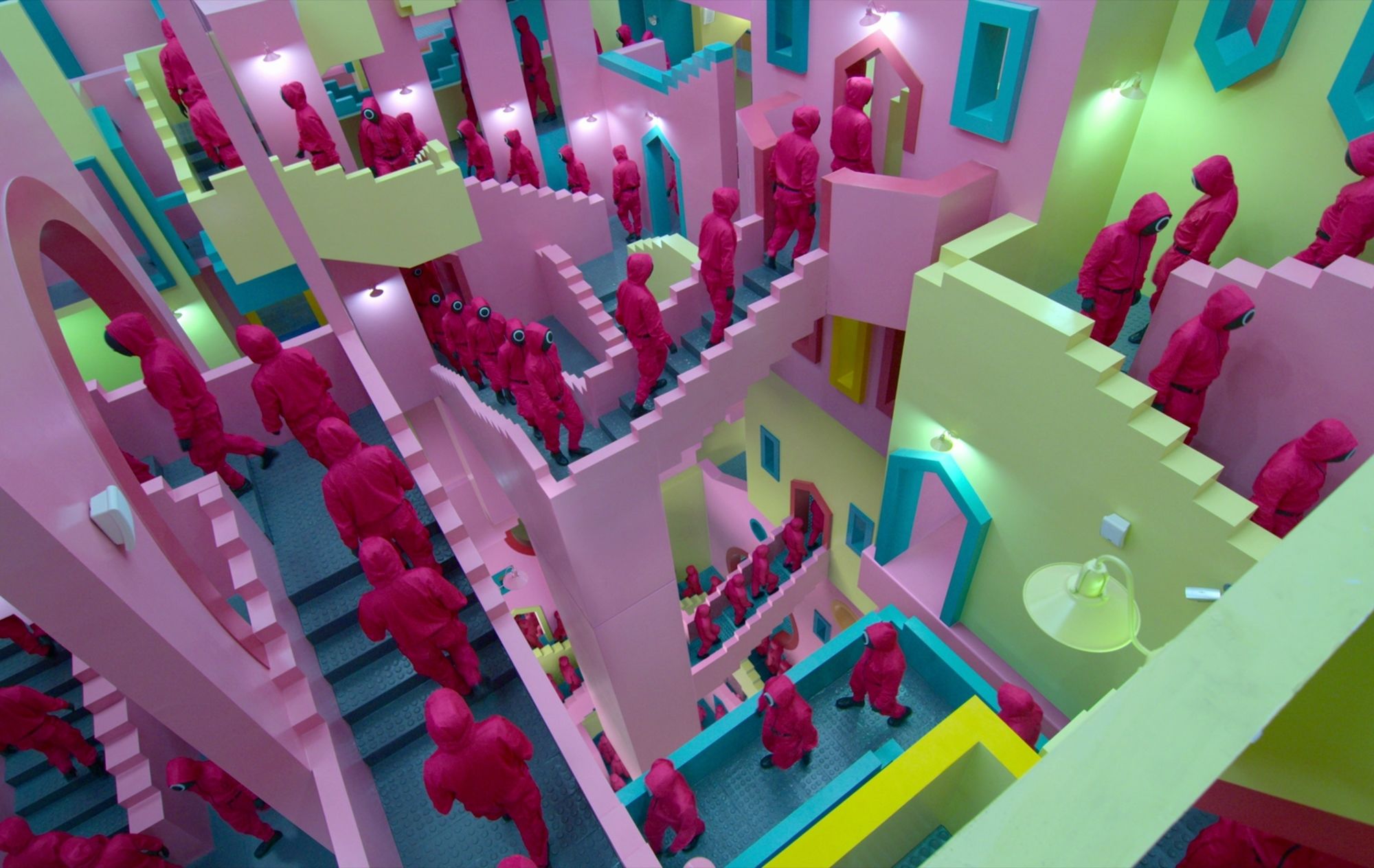
Since its release, the Korean Netflix series “Squid Game” has gained massive success and popularity. The series rose to success not only because of its plot but also because of its unique set architectural design that speaks volumes about the series’ message to its audience. According to director Hwang Dong-hyuk, the production design created for the series was also designed to mimic the ambience of real playgrounds where childhood games are played so that the actors could enjoy the setting as if they were children.
Here are the unique and interesting sets of the series and where it took its inspiration from:
1. The Stairs
Image from Netflix
The stairs piqued the viewer’s curiosity since they appear playful and energetic due to their colors, yet they are also gloomy and twisted due to the maze-like staircases. The steps were inspired by the lithograph print relativity by Maurits Cornelis Escher (1898-1972), a dutch graphic artist whose work is highly recognized among physicists and mathematicians, according to the series’ director Hwang Dong-hyuk in an interview. It was like a labyrinth, trapping the consciousness of anyone traveling through a mind-bending stairway.
Images from Mcescher.com
The perplexing and disconcerting design channeled exactly how the production wanted the audience to feel. Though the design was inspired by Escher’s work, the brilliant colors of the staircase were inspired by architect Ricardo Bofill’s “La Muralla Roja”. The “La Muralla Roja” is a building in Calpe, Alicante, that was started in 1968 and completed in 1973.
Image from Amazing Architecture
The complex was painted red on the outside while the internal walls were painted blue and violet, inspired by a citadel or castle in North Africa.
2. The Korean Neighborhood
The street walls and gates during the Marble game are other examples of Squid Game’s construction masterpieces. The location, which consists solely of gates and walls, appears to be a traditional Korean neighborhood where the majority of children grew up.
Image from Netflix
It tugs at the audience’s heartstrings, bringing back memories of the location and the people they grew up with. As a betrayal of one character to another played out on stage, the sunset created a mood of sorrow. The building, which is most commonly seen in traditional Korean neighborhoods, offers a superb picture to the scene’s narration, further heightening the viewers’ emotions.
3. The Gigantic Playground
Images from Netflix
The larger-than-life playground in the series featured cartoonish clouds and a sun painted on the walls to create a faux sky. “When we were little, the playground appeared incredibly vast,” Hwang remarked in an interview, “so we developed a giant playground for grownups.” This enormous playground was built in this manner to reduce the contestants to simple puppets of the wealthy, with whom they might play.
4. The Minimalist Waiting Lounge
Image from Netflix
Before the Tug-O-War and Marble Games began, the contestants in the series were placed in a large empty white waiting lounge. The candidates’ fear and discomfort were heightened by the utter lack of color, which gave them the terrifying impression of not knowing what lay beyond the chamber, or what would happen next. “[We’re trying to produce] that unpleasant sensation that comes from being in a white room and not knowing what’s going to happen next.” “We wanted to establish an uncharted territory,” stated Hwang.
Images from Pinterest
With its curving walls and white interiors, the waiting room in which contestants are contained before games seem like a nod to one of Zaha Hadid’s masterpieces, particularly the Heydar Aliyev Center. The waiting room is devoid of color, in stark contrast to the brilliant colors seen in most of the prior games’ set designs.
The next time you watch Netflix’s Squid Game, better take time to observe closely to see these architectural and design details!
RELATED ARTICLES:
Affordable Aesthetic Desk Lamps You Can Buy Online for Your Home Office
What’s Inside Andrea Brillantes’ ‘Dream Teenage Room’?
ICYMI: 8 Interesting Details in Angel Locsin and Neil Arce’s House
CITATIONS:
Foley, J. (2021, October), Did Squid Game Its Look From A Spanish Real Estate?, Creative Blog: https://www.creativebloq.com/news/squid-game-architecture
Keskeys, P. (2021), The Architecture of Squid Game, Architizer: https://architizer.com/blog/inspiration/stories/the-architecture-of-squid-game/
Barratto, R (2021), Squid Game Minimalist Chic Spaces of Oppression, Arch Daily: https://www.archdaily.com/969927/squid-game-minimalist-chic-and-spaces-of-oppression
![]()


 Facebook
  Instagram
  Linkedin
  Twitter
  Youtube